The internet is loud, attention is expensive, and audiences are exhausted. In 2025, the most effective rebrands didn’t try to “break through” with spectacle; they optimized for recognition. They were built for the split-second realities of modern life: a thumb scroll, a delivery app grid, a shelf glance, a tiny phone icon. Across generations, people crave brands that feel easy to read, easy to trust, and easy to choose. The result is a year of rebrands defined less by surprise and more by signal, with refined systems that reduce friction, sharpen memory, and make the brand feel obvious again.

Walmart: When Restraint Builds Trust
Walmart’s refresh is a study in what brand trust looks like when consumers are financially cautious and decision-fatigued. Instead of reintroducing itself, Walmart simply clarified its identity, brightening its blue and strengthening its typography to feel more confident without losing familiarity.
“Restraint is the smarter move when there’s concern that your consumer won’t come along with you,” says Michael Terranova, Creative Director at Fletcher Knight. “Walmart’s core audience values stability. They’re financially conscious, practical, and grounded. Incremental change respects that relationship.”
In a climate where criticism can spread instantly, scale brands don’t get to experiment the way niche brands do. Ean Turner, Senior Graphic Designer at Fletcher Knight, reinforces that recognition is an asset worth protecting.
“When you’re well known and consistent, you don’t want to disrupt that. Big changes can throw consumers off and even cause backlash.”
Emotionally, the refresh lands because it feels like a helpful upgrade, not a brand trying to reinvent itself. Walmart becomes slightly more optimistic and contemporary, but the mental shortcut remains intact. It still looks like Walmart.

Amazon: Expressive, But Still a Tool
“Amazon is extremely transactional,” Terranova explains. “I don’t need an emotional connection when I’m shopping here. But the updated smile does amplify joy in the shopping experience.”
That’s an important cultural distinction in 2025. Audiences don’t want forced intimacy from brands that exist primarily as utilities. Turner reads Amazon through that same lens.
“It’s more of a tool than a brand you emotionally connect with. The organic shape of the smile is interesting, and that expressiveness could be pushed further into the UI.”
The design moves are emotionally modest but psychologically smart, reducing coldness without slowing the machine.

Domino’s: Speed, Recognition, and Digital Confidence
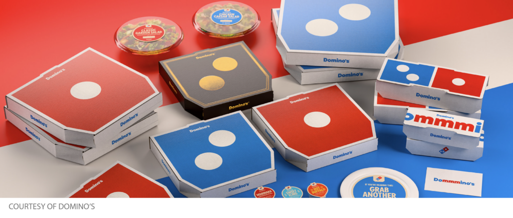
Domino’s continues to prove that when a brand becomes iconic, the name matters less than the visual language. The updated system leans into bold color, modular graphics, and speed-to-recognition, perfectly aligned with digital ordering behavior.
“It almost feels like Nike,” Terranova says. “The logo is so recognizable that they can play into graphic elements rather than the brand name and still have a huge presence and speed of recognition.”
In a culture trained by interfaces, the brand’s colors do the same work as an app icon. They trigger immediate certainty.
“Once you see it, you know exactly what it is,” Ean Turner explains. “Muted palettes feel homemade and suggest slow cooking. Domino’s colors here say fast, digital, and efficient.”
Domino’s doesn’t try to look artisanal because its value proposition isn’t artisanal. The rebrand succeeds because it amplifies what people already use Domino’s for: frictionless convenience.

HBO: Reclaiming Singular Identity in Streaming
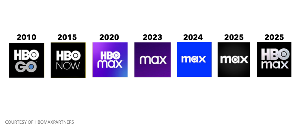
If 2025 taught brands anything, it’s that clarity is not optional, especially in crowded categories. HBO’s naming journey became a case study in how quickly equity can be diluted when the core meaning gets blurred.
“HBO carries weight,” Terranova says. “Max was confusing. HBO is the iconic part of the name. Dropping it diluted the brand’s authority.”
The return to HBO Max isn’t just a name correction; it’s a restoration of cultural memory.
“It reminds me of the metallic HBO openings before movies,” Terranova adds. “There’s a cinematic nostalgia there that people trust.”
Turner highlights the strategic need for distinctiveness.
“Just Max didn’t feel singular. Bringing back HBO reinforces what it stands for. Premium storytelling.”

Back to Nature: Heritage Versus Modernity
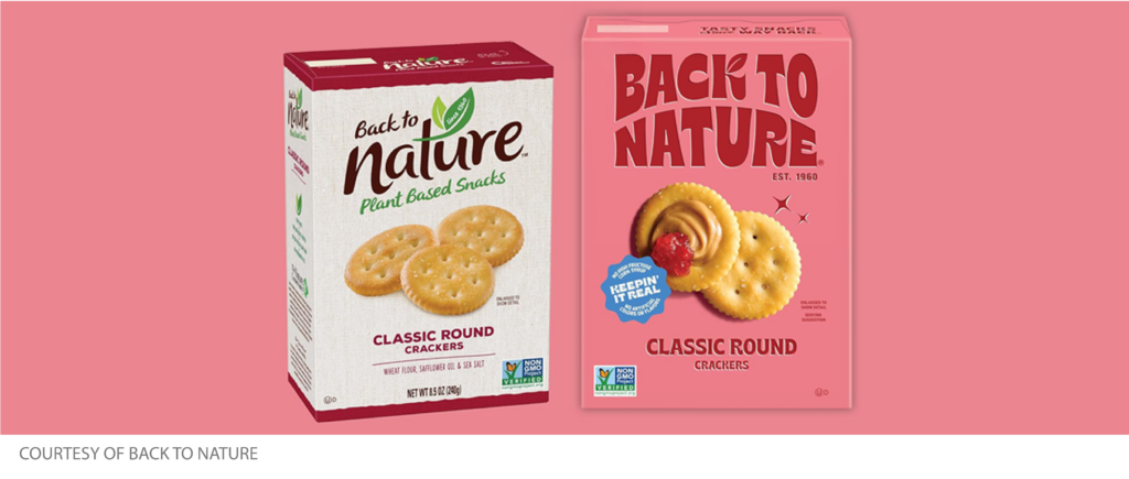
Across food and consumer packaging, younger audiences are paradoxical. They love vintage cues but demand modern credibility. That’s why typography is doing so much heavy lifting in 2025. One standout rebrand, Back to Nature, borrowed from 1960s design while pairing it with bold color and contemporary photography.
“The new system feels modern and trustworthy. The bold type could have felt artificial, but the photography grounds it,” Terranova explains.
“It has massive shelf presence,” Turner says. “It stands out immediately against competitors.”
This is the new formula. Heritage cues for emotional trust, modern execution for contemporary standards.
The Bigger Pattern: Why 2025 Rewarded Restraint
In a year shaped by overstimulation, tighter budgets, and cultural fatigue, the best rebrands moved away from attention-seeking and toward recognition-building.
“Joyful and modern doesn’t always mean new,” Terranova says. “Sometimes it means clearer, warmer, and more intentional.”
“If people instantly know who you are, you’re already winning,” Turner adds.
The quietest rebrands didn’t just look better, they made the brand easier to understand, remember, and choose.


